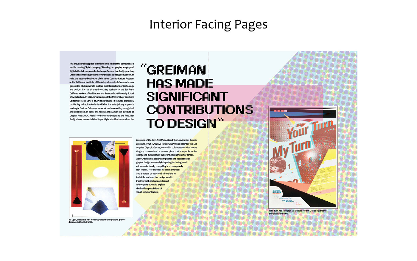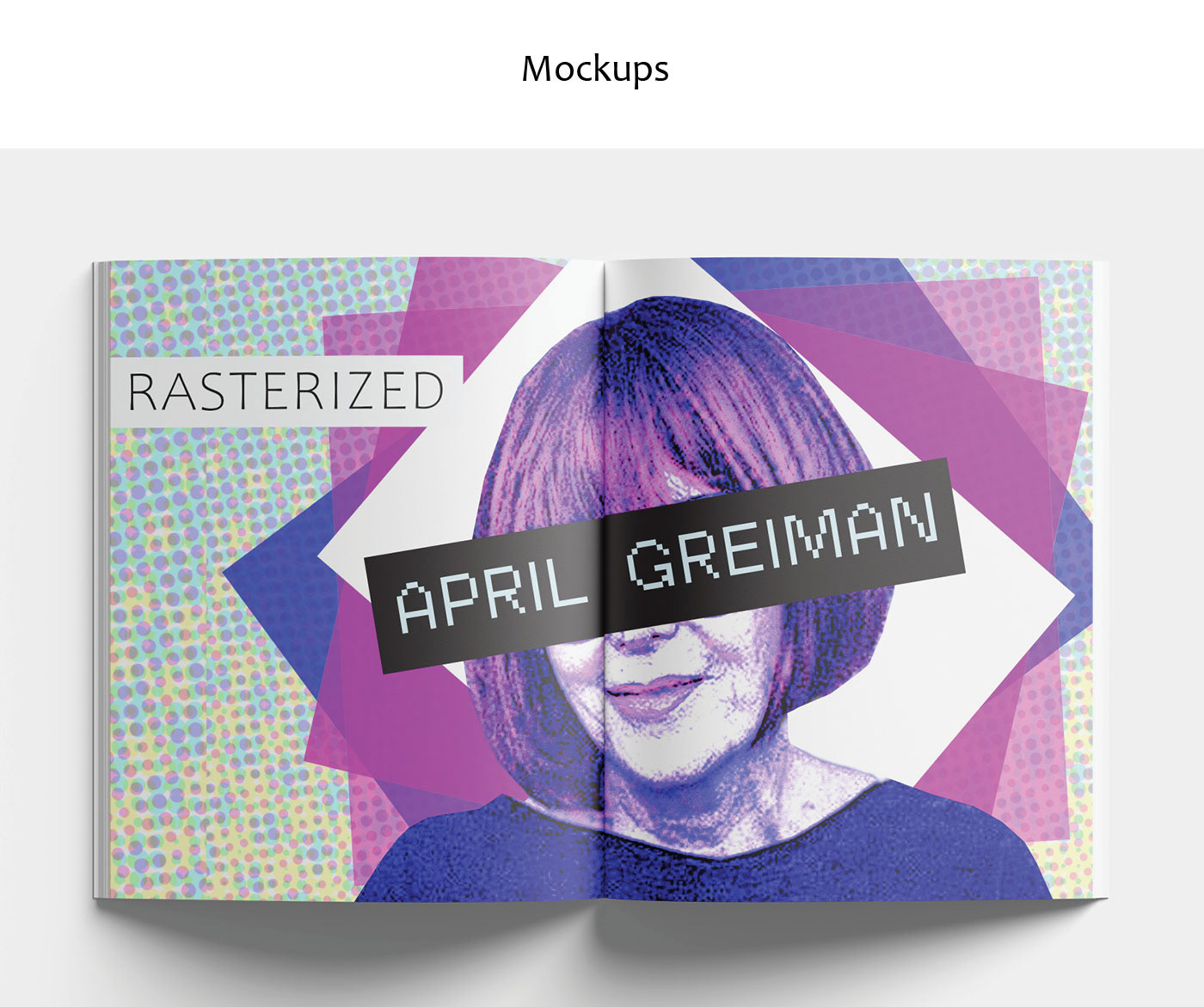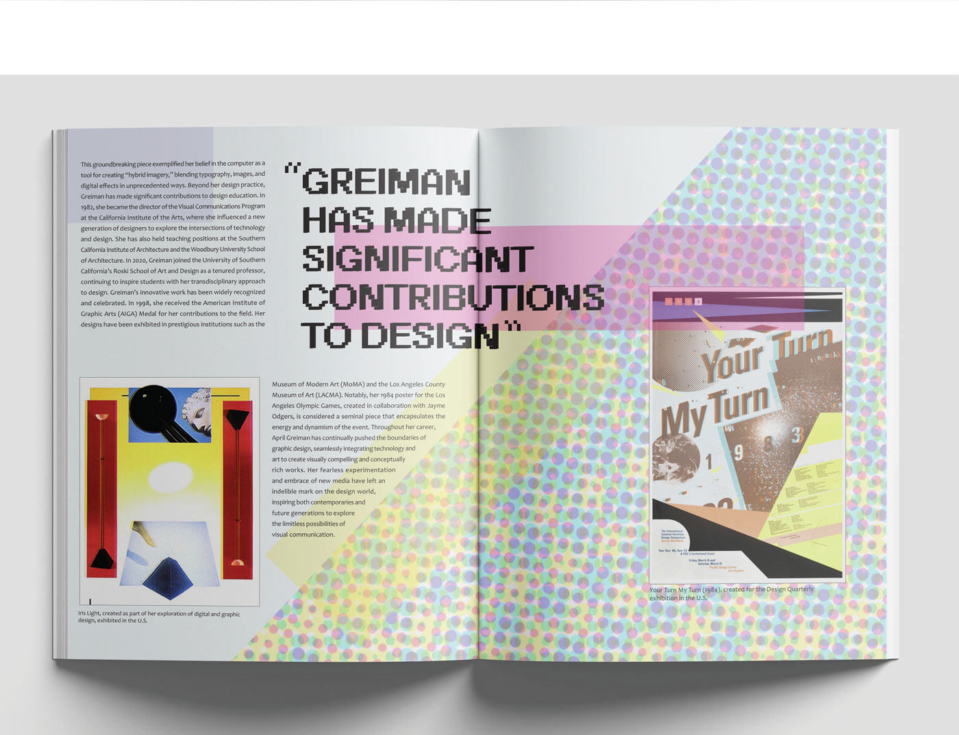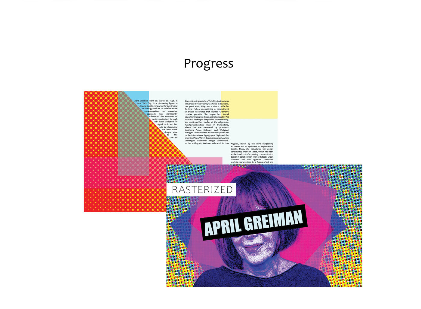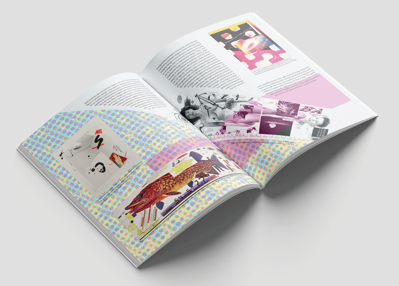

For the project Rasterized: All About April Greiman, I created magazine spreads inspired by Greiman’s distinctive style. The task was to design layouts that reflected the aesthetic of an assigned artist, and I focused on April Greiman. To prepare, I conducted extensive research on her work and visual language. One of the biggest challenges was learning how to effectively replicate her unique approach. My grid uses a two-column structure on one page and a single column on the facing page, echoing layouts seen in her designs. I chose a bright color palette featuring blues, greens, and reds based directly on her artwork. While I didn’t use type as image, I wrapped text around imagery in a way that still reflected her dynamic compositions. The fonts I used include Candara at size 9 for body copy, Candara at size 64 for the magazine title, CoFo Sans Pixel at size 49 for pull-out text, and a large "April Greiman" text element at size 80.